Scrap SMART- Step 9: Learn three scrapbook techniques!
You have a stack of beautiful photos printed out…now what? How do you build a scrapbook page?
Are there scrapbook page layout templates? Are there simple scrapbook layout ideas? YES! They are right here! Learning three simple techniques will help you put together pages that are beautiful, but don’t bog you down. It’s called Elegant Simplicity and its just like your mom told you…less is more!
Tip#1- Snap to Grid Technique!
Most people print their photos in 4x6 format either vertical or horizontal. When you lay those photos on a 12x12 scrapbook page, you want to use the space effectively. Putting more photos on your page, makes your album a better value for you. It also keeps the focus where it needs to be- on the PHOTOS!
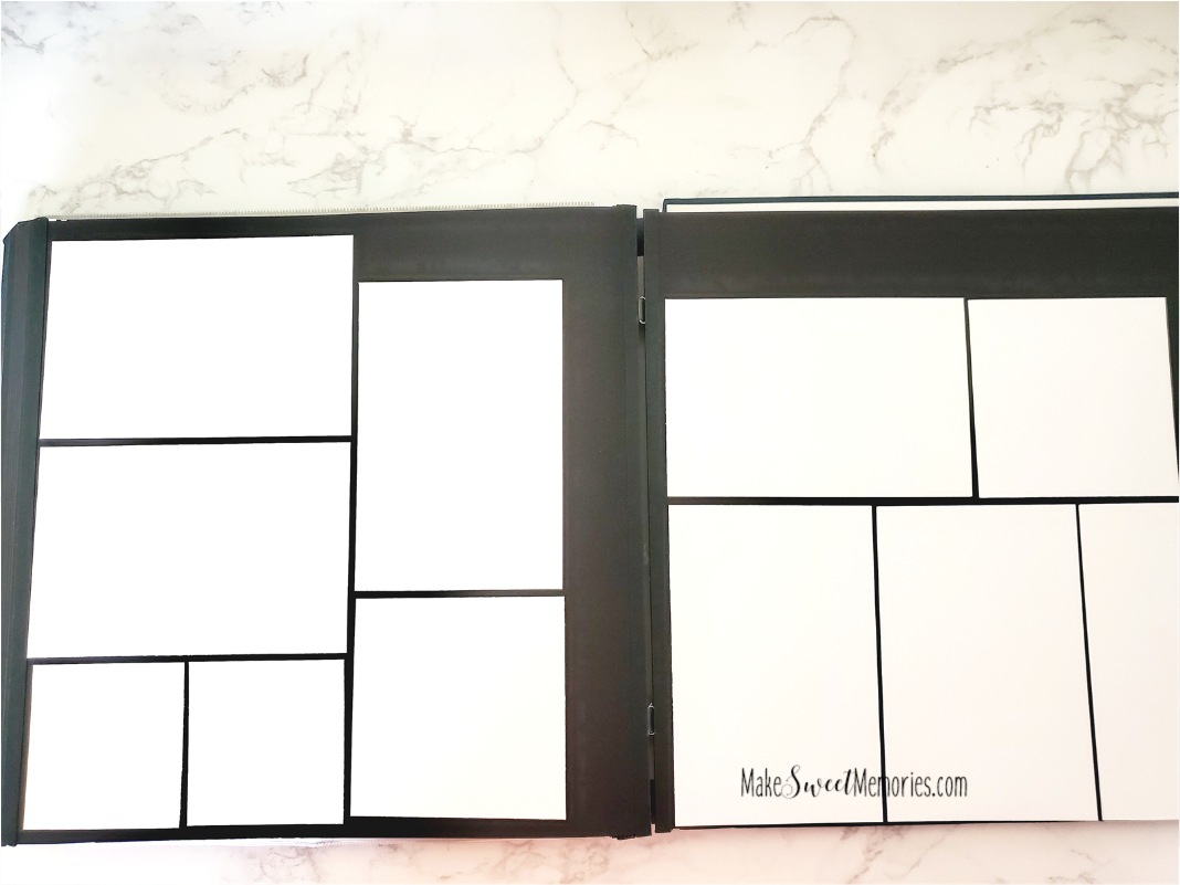
Pretend that your 2 page spread is made of graph paper and you are lining up your photos with a little break between them to create what is called an “eyeline” or gutter. This is what magazines do with their articles or yearbooks do to maximize their layout space. You may have to trim a bit off the bottom or sides to fit 3 photos next to each other with the eyeline between them. When you lay out your 4x6 photos, you get something like this picture below.
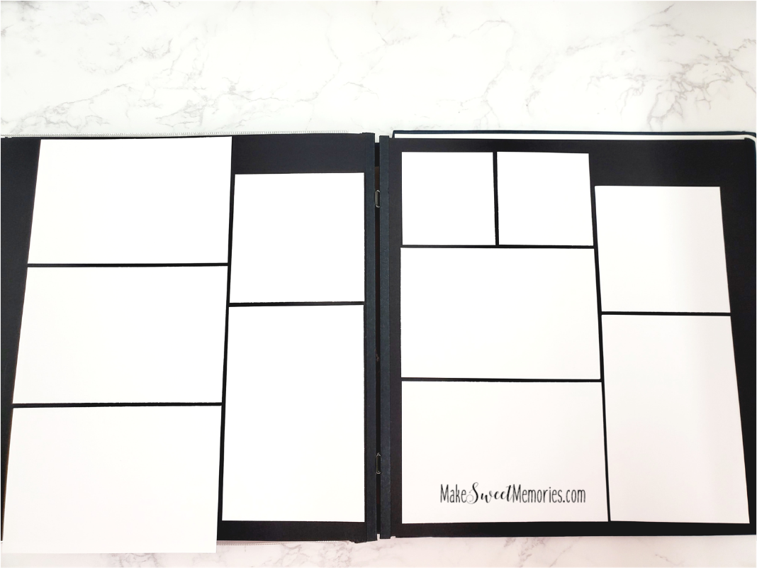
Now what to do with the leftover space? How can we maximize that? We want to journal and leave space to tell our story. That is the most important embellishment of all! Some photos can be cropped to a 4x4 or 3x3 size and eliminate background that can distract from your subject. Why these sizes? Because a 4x4 photo fits right next to or underneath a 4x6 allowing you to “snap your photos to grid”. You can fit two 3x3 size photos underneath a horizontal 4x6 photo. You need to trim them slightly to create space for the “eyeline” but they look great! You will see how keeping the eyeline in there and everything lined up pretty makes grouping your photos EASY. You never have to spend time wondering…what do I do with these page? Like the photo below.
One of these spaces can be used for a journaling box, or you can always use a “peekaboo”pocket and layer a few more photos on this two page spread and include your journaling. (If you don’t know about peekaboo pockets, look at my video on my Facebook page that talks about Scrap SMART Step 9.) You can see what I mean there. You still have room to title the page, with alphabet sticker letters or a title made with a cutting machine like a cricut. You can push the photos toward the middle of the two pages if you prefer. Try different combinations of the 4x6, 4x4 and 3x3 photos for some variety. There are endless options! You can use a 5x7 or 8x10 enlargement every once in awhile to create a different look. Using the SNAP to GRID technique provides a clean consistent look to your album pages and they are easy to look at! Everything flows and what you see are the pictures! They are the heart of your page.
Technique #2- Adding blocks of color!
You can use blocks of colored paper to add in some fun patterns and colors to your page without taking the time to mat individual photos. I used to mat photos individually, but it is time consuming and if you want to emphasize a certain photo, you end up with a double or triple mat to set it off. There is a simpler way! You want to bring in color to enhance and not distract from your photos. You want your eyes drawn to what matters most, your photos and story!
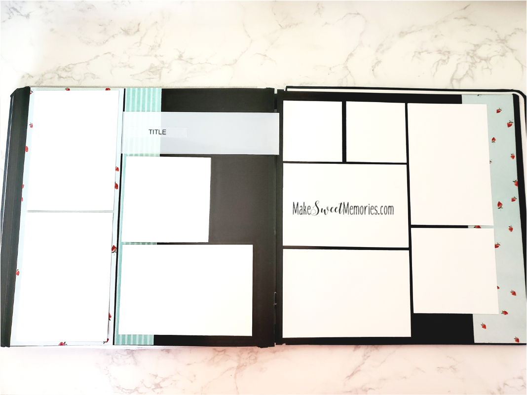
You can load blocks of colored cardstock on your pages either vertically or horizontally. A simple tip for you is this: Cut a block of paper at 4.5x12 inches and lay down a vertical photo on top of it and you have an instant mat around the edges of that 4x6 photo! You can add in some decorative laser borders here or 12 inch border stickers to add a little pop very quickly. Look how the color on this page makes a difference!
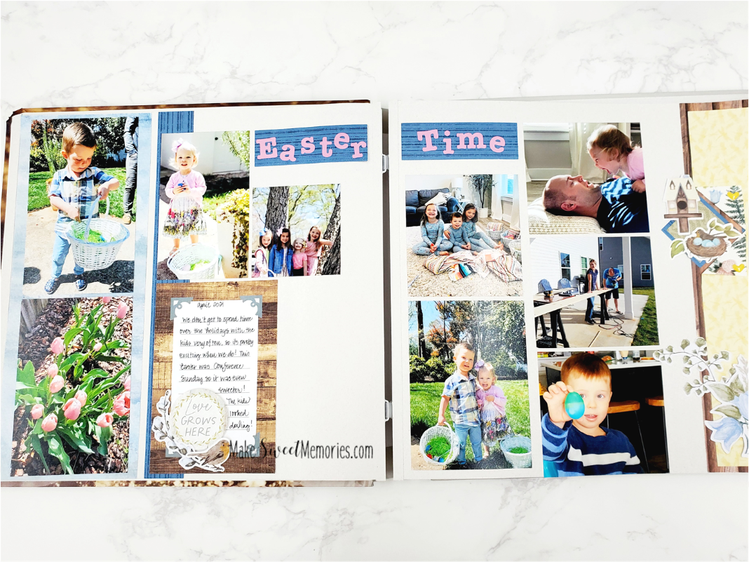
I used a block of 4.5 x 12” cardstock and a skinny strip about 1.25 x 12” on the leftside and a border on the rightside of this 2 page spread. I prefer complementary accents, not two that are exactly the same. I used the Spring Cottage Collection for this layout. There are so many fun pieces! Love the wood journaling card, which brings in the wood paper on the right side border.
Technique #3- Embellish with purpose!
I sure wish someone would have taught me this early on in my scrapbooking! Grouping together or clustering elements provides a grounding for them, like they are SUPPOSED to be there. Clustering looks best in odd numbers, 3, 5 or 7 elements. Too much is too much! My favorites are the groups of 3- simple and sweet. Look at the journaling card in the layout above . It is a plain wood card, but I added the circle piece that says “Love grows here” and the spray of flowers and the bird. They all work together and give a nice clustered corner. It adds something, but is not so much it takes the focus off the photos. I like to add something around my journaling to draw the eye in there, because the story is the very best embellishment of all! I used to be a little concerned about leaving “white space” on my page- I felt like it needed to be filled with something. Now I group my photos with the snap to grid technique and there is less white space hanging out alone on my pages. You do need some white space for your to rest. But using these three techniques I can maximize the surface to show off what matters most to me- my photos and story.
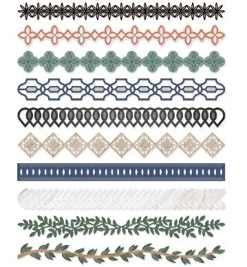
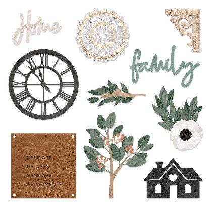
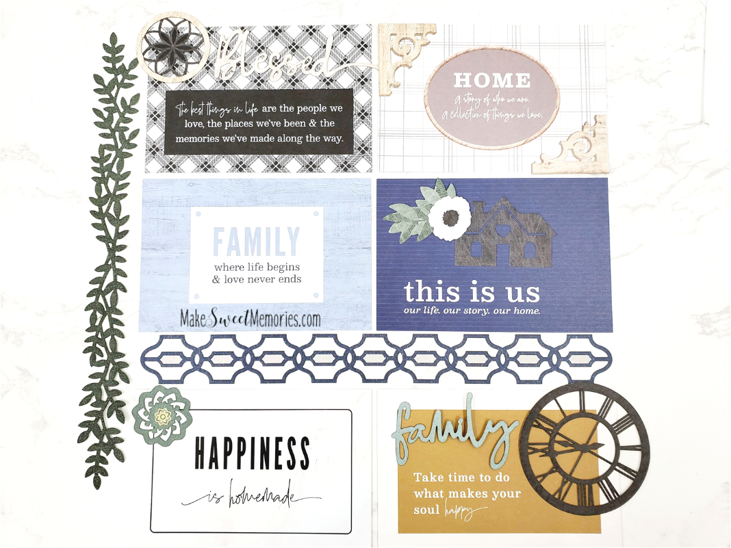
Creative Memories offers beautiful embellishments! Some of my favorites are the laser cut borders. They are made from a thicker paper but cut in delicate designs which are so fun to group together! Those pictured below are from the Homestead Collection. Note the example in the middle below, using both types of laser embellishments in a cluster of three. If you would like to see more click here.
Combine the accents with a laser cut border piece!
There are 30 different pieces in each pack- this is a sample.
I put together a few pieces from the HOMESTEAD COLLECTION to show you how EASILY these accent clusters come together. You can combine them on the journaling cards to make titles for your pages. So many ways to make it cute! When you have the right pieces, you complete pages QUICKLY with a look of elegant simplicity, while still keeping the main thing (photos) the main thing.

