Scrap SMART- Step 7: Create a Color Palette for your project
“ALL MY LOVE” Collection from Creative Memories
One critical element of your scrapbook project is to create a color palette before you start! It provides a base to work from, and limits your choices so you don’t spend large blocks of time wondering what papers to use and where to find them. From a design standpoint, you will end up with a more cohesive looking album that is pleasing to your eye! You will love it!
One thing I love about Creative Memories albums is that each project is completely customizable! You decide on the color of the coverset, if you want to engrave the spine and what color of scrapbook pages you will use. You can even create a custom cover with a photo if you choose- there are multiple options! They have white, black, spargo and natural refill scrapbook pages. The spargo is small specks of color on a white page. The end result is speckled-more of a light gray page that looks like the inside cover of your coverset. You can also purchase a refill called a FAST2FAb Refill pack. This refill pack is predesigned for you, but costs the same as the plain refill pages! If you would like to have the design DONE for you, check those out! They are a great speed tool!

These Fast2Fab refill pages have designs printed directly on the page!
Each pack comes with 16 pages and 16 page protectors, which you slide on over your page once it is completed. This protects the page from sticky hands, sneezes and any acid from your photos or memorabilia. You can add in a second set of pages to have 32 pages or 64 sides in an album. I recommend 32-36 pages. Personally, I would not go beyond that- the book gets too bulky and too many pages will add pressure to the binding.
Look at your subject matter for the album and choose a designer paper pack that you feel will work well for you. Spread it out on your table to look at each of the papers. Do they all work or should you eliminate some? Each paper is doublesided, which will provide a variety of options. What other collections do you have that could coordinate with your base collection? Often, you will find papers that you can add in, with similar tones. What solid color cardstock works with this project? Do you need an accent color to brighten up your palette? Would some shimmer papers work? It is critical to limit your choices before you start working, to keep progressing quickly on your album. There are many shades of red for example- be sure you have matching shades in your palette for the most coordinated finished product. This is the secret ingredient to make your album look classy!
What scrapbook color combinations look best? You want to pull the colors from your photos if possible, so they blend with the papers you chose. If you are using vacation photos, you can draw on natural colors that are in your photos. Then add some color in to pop those photos a bit. Make that your accent color. You don’t want to look only at the two page spread of photos in front of you- but look at your photos overall. Creative Memories has a variety of designer and tone on tone collections that have matching stickers, embellishments and mat packs. They have done the work for you! When you start there and build it out, you are saving time using coordinating elements.
If you have a project where there is a wide variety of colors in your photos, look at what appears the most, or what colors could be used as neutrals for your base with a few others to accent with. You may not be able to match all the colors in your photos, but if you have an overall palette, everything blends- like a storybook would. If you stop and start with different palettes for every 2 page spread, your album does not “flow” as well. Having one palette will connect your pages and is more pleasing to the eye, and will save you a LOT of time!
I keep all the papers I will be using on one project, in a Power Project folder. There is space for embellishments, journal boxes and mat packs that coordinate. If you want to purchase more Power Project folders, you can get them here.
Look at your papers for colors, textures and patterns. Limit your bold patterns, and when you use them, try them in smaller spaces or use a bordermaker cartridge to punch a layer with them to bring in the pattern in a softer way. You always want to keep your photos the heart of your page! If you like a really clean, classic look, start with your solid cardstock and just add in a little patterned paper here and there. I do emphasize journaling in scrapbooks, so I love the variety mat packs that are available from Creative Memories. You will see there are two different sizes. One is 4.5x6.5, and it will mat a 4x6 photo perfectly without any trimming! This is a huge time saver! I keep those larger mats in the bottom left hand corner pocket. Anytime I need one, I can reach there for the perfect size. I keep journal boxes in the bottom righthand corner pocket so I know where they are. There are also sheets of ruled paper that you can cut to fit any space on your page. (You can watch my video on my Facebook page to see this in detail.)
When you flip to the backside of the folder, you will see it is divided in half lengthwise. The rightside I use for any coordinating stickers and the left side for borders I have made that could work or longer strips of cut paper so they are easy to find.
Now you have everything you need in ONE place! When it is time to work on your album, you can go right to it! If you are working on your project outside of your home, it is easy to pick up your Power Project folder and know you have everything you need with you!
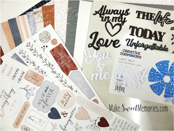
You can see how I used the ALL MY LOVE Wedding Collection and the KEEP THE FAITH Collection together, as they blend beautifully! I also purchased some laser titles from the NATURAL DISPOSITION Collection because they had titles in gray and white. I am adding in some SHIMMER paper and some solid color cardstock to stretch my palette and be sure there isn’t too much pattern on my pages. I want a cleaner, more classic look with my wedding photos. So many times, LESS is MORE!

ALL MY LOVE and KEEP THE FAITH Collections by Creative Memories
I do keep my Index sheets from each collection together and looking at them is a fast way to see if I have papers that could work with this project that I have already purchased. You want to be able to use papers you already have in your stash. I used my Happy Planner Punch to punch each sheet vertically and put it on a ring so it is easy to store.
Choose an accent color to brighten the palette. Each paper is doublesided so you have a myriad of choices! Spread them all out on your table and see if you have a good mixture of dark to light colors, neutrals and your pop of accent color. Then move into your solid color cardstock and find a few sheets that work with your specific palette. This helps extend your palette and separates your patterns, giving your eye a rest. Too much pattern can be overwhelming and take attention away from your photos. We don’t want that! Your photos are always the focal point of your page.
If you need more solid cardstock, you can always go back and add in more! If you are ever traveling to another location to scrapbook, you know you have everything you need with you to work. You can grab a few extra folders with your solid colors in it, instead of taking every color of paper you own with you! Once you have placed all the components- (papers, embellishments, stickers, variety mat packs) you need in your Power Project Folder, you are ready for the next step!
Having a color palette for your project helps you to stay focused on what you actually need. When you see fun collections being released, you will know right away if that is something you can use and build on for your current project or the ones you are looking to complete this year! Make the time to build your color palette before you start before you move onto Step 8! (If you want more details, go watch my video on Step 7 on my Facebook page.)